# Animation on the Web: Theory
# Why animate?
Animation, in general, has a lot of uses, but for this lecture, I want to focus on how important it is for user interfaces and user experience.
Animations enhance the way users interact with an interface. For example, smart animations can reduce cognitive load by giving users better context between page transitions. They can provide clear cues to users, like where we want them to focus attention. Animations serve as another design pattern in and of themselves, helping users to get emotionally attached to and engage with the interface. Another benefit of using animations is that they can create a perception that a site or app loads faster than it actually does.
— Prasanjit Singh Writing Animations That Bring Your Site to Life (opens new window)
# Animation on the Web
This is an attempt to categorize some of the uses of animation in digital design. There is a lot of overlap between the categories, but the main point, as always, is think about the user.
# Drawing the User's Attention
Blinking, flashing, movement to attract the eye.
Obviously, this can be a "dark" pattern, like using animations to get people to look at advertisements. But it can also be used to show a new or transformed element.
On this site, the animated "entrances" draws attention to the main copy points.
playcharms.com (opens new window)
# Demonstration and Narrative
Anything that takes place over time may benefit from an animated explanation, including instructions and explanations.
Storytelling Map (opens new window)
# Entertainment/Mood/Dimensions
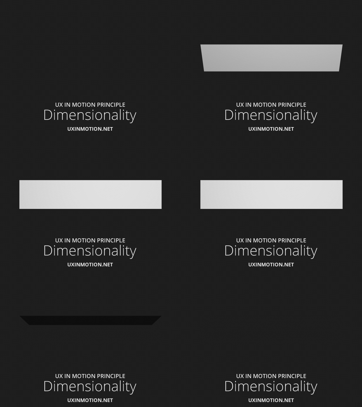
Effective animation can also be used in narrative or to strengthen a visual's message (essentially, a third or fourth dimension to graphic design). It can also be used simply to add a sense of fun and make a design seem less flat.
# "Delight" (while not breaking user expectations)

# Feedback
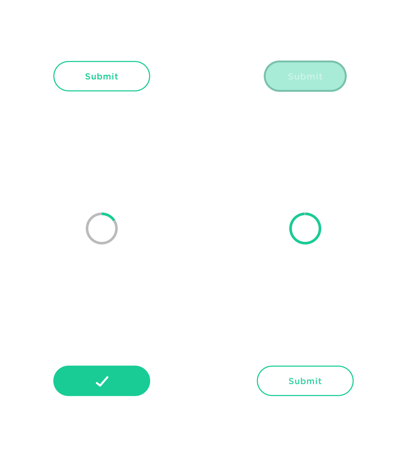
Often our electronic interfaces take some time before an action can be completed, animations like spinners and loaders let the user know that something is happening. Hover effects can let the user now they've entered a clickable area.
# Transition Smoothing
Animating a scroll, a slide, etc. feels more like the real world. Abrupt changes simply don't feel correct because they are disconnected from how we experience the world.
Think about turning the pages of a book, or rotating something in your hand. Think about the relationship of a virtual button to a real button on an electronic device.
# Reducing Change Blindness
Change Blindness (opens new window) occurs when an interface changes quickly, and the new information isn't noticeable to the user.
Animation can help alleviate this affect:


# Principles
# Easing
Linear animations don't feel natural, because they don't feel like the real world (typically for something to stop, it needs to slow down first).
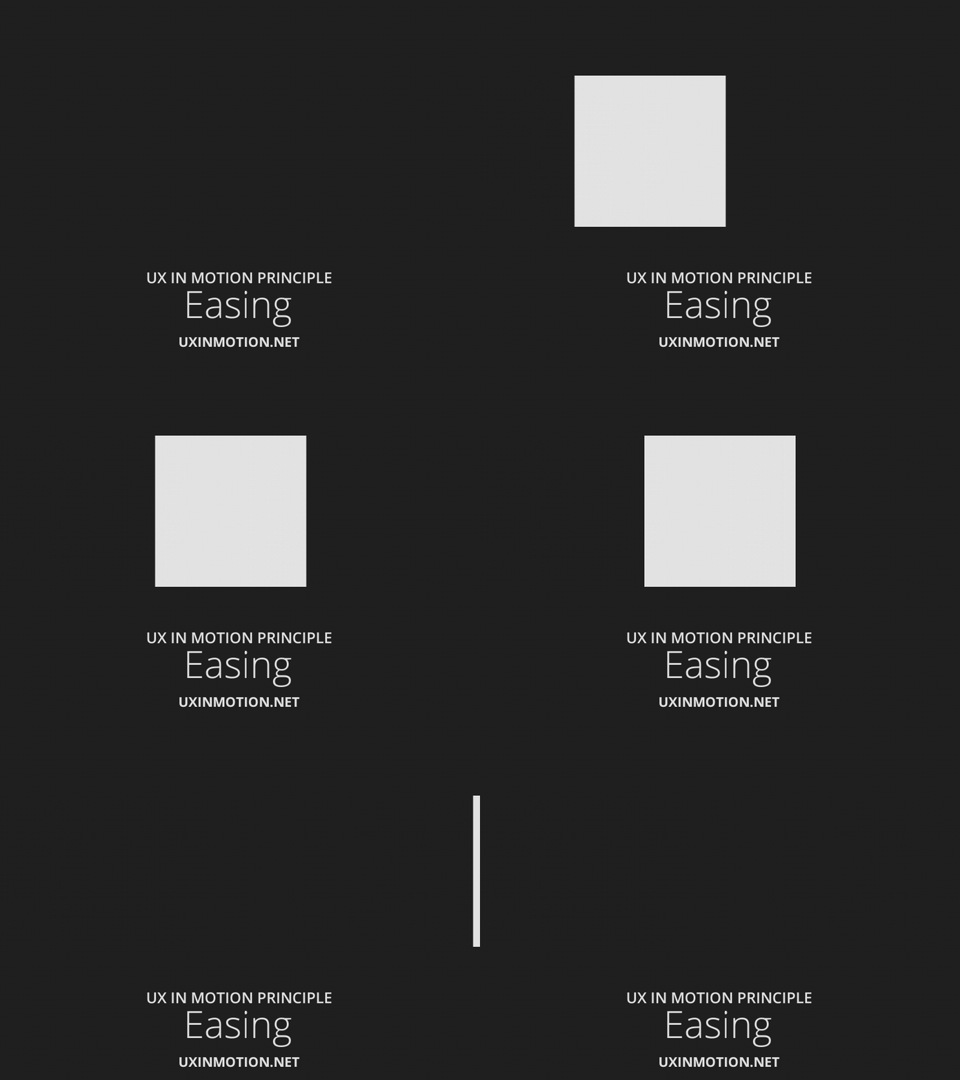
Google Developers: The Basics of Easing (opens new window)
cubic-bezier.com (opens new window)
# Continuity
Reducing change blindness with a ranged dynamic value:

Reducing change blindness with static values:

Transformation creating continuity and reducing change blindness:
# Relationships and Layers


# Obfuscation/Obscuration
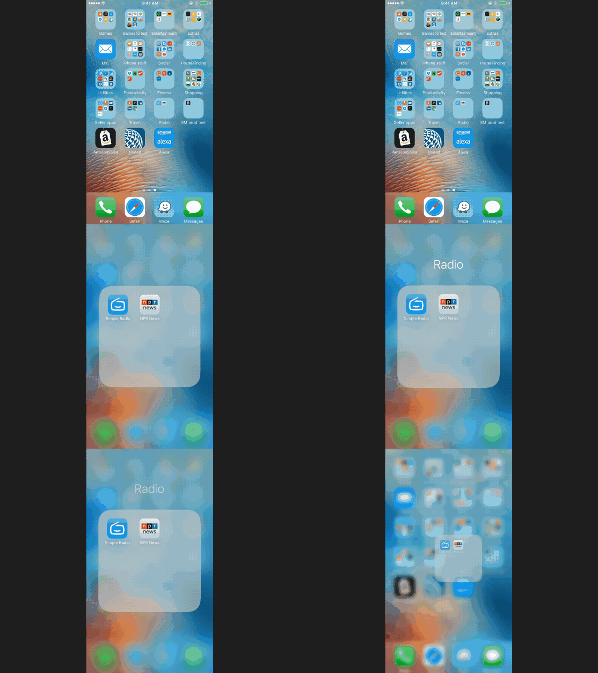
Obscuring your user interface to force the user to focus on something else can be a useful strategy. This usually lets the user know the old interface is still there, but simplifies the layout and forces them to focus on the new item.

# Parallax
Parallax effects are basically just the idea that different layers move at different rates. This is either during animations or during scrolling.


It's been a bit overused lately. But, done with subtlety, it can be effective for giving a site a sense of depth. The caveat? besides fixed background effects, parallax on the web requires quite a bit of javascript.
# Don't overdo it
Too many things animating means its hard for the user to know what to pay attention to. Animating everything is equivalent to animating nothing. Additionally, animating too much can be a big performance hit and cause slowdown's in the user's browser.
# Sources
The Importance of Context-Shifting in UX Patterns (opens new window)
Transitional Interfaces (opens new window)
Creating Usability with Motion (opens new window)
The Ultimate Guide to Web Animation (opens new window)
Smart Transitions In User Experience Design (opens new window)
The Guide To CSS Animation: Principles and Examples (opens new window)
5 Mistakes to Avoid When Designing Micro-interactions (opens new window)