# Project 3: Good UI
# Effective User Interface Design
Points: 100
User interface design is evolving rapidly, making digital devices easier and easier to use. But competition online is fierce, and engaging the user with better user-interface practices can go a long way.
On this assignment, you will practice some contemporary user interface design patterns, and see how they relate to common past solutions.
# Objectives
- Practice designing user-interfaces/web layouts in digital specific design software (Sketch).
- Applying the design of typographic hierarchies for the screen to some more specific content.
- Create examples for discussion on what constitutes good/better user interface design patterns.
GoodUI.org (opens new window) is a consultancy that utilizes A/B tests and analyzes the results to give data-driven advice to companies who are selling on the web. What this means for you is it has some good ideas about what kind of patterns improve user experience, user engagement and ultimately the financial success for the websites using these patterns. We're going to look at a few and develop designs around them.
- Go to goodui.org (opens new window) and look at ideas...
- Use these examples to make 4 designs, each in multiple formats.
# Sketch and Grids
For the following designs, I'm providing a starter Sketch. You are required to use Sketch on this project There is a 12-column grid for desktop, and a 4-column grid for mobile. Template sizes are required, but you can adjust the grid if you'd like (either number of columns, or their width or their gap width).
Sketch Documentation: Rulers, Guides, and Grids (opens new window)
The lab computers should all have Sketch installed. If you'd like to use Sketch on your personal computer, you can start a 30-day trial.
# Design Summary
You’ll be designing a series of before and after graphics at different sizes. First, you will design the “before” version at a given, typical, desktop size. The before version represents an old, or at least, less thoughtful approach to a user interface problem.
Then, for your after designs, I recommend you try designing them “Mobile First”. Then, when your mobile design is solid, you will create a desktop version of your design, repositioning or resizing elements as necessary. “Mobile First” is a design philosophy summed up with this quote:
The mobile-first approach is a tenet of progressive enhancement. It is the ideology that mobile design, as the hardest, should be done first. Once the mobile design questions are answered, designing for other devices will be easier. What it boils down to is that, the smallest of the designs will have only the essential features, so right away you have designed the heart of your user experience.
— Ben Gremillion
Read about the reasoning and the pros and cons of this approach yourself:
A Hands-on Guide to Mobile First Design (opens new window)
Mobile First (opens new window)
# #7 Try recommending instead of showing equal choices.
goodui.org/#7 (opens new window)
Create 3 products of your choosing (can be real or made up, but you'll need an image to go with it). I recommend making these products something you're interested in.
# Before Design:
- 1024px × ~800px (it's okay to change the height)
- Create the 3 products on the page.
- Each should have an image, a price, a product name, 1 sentence of lorem ipsum (product description) and 1 other piece of data.
- Give each product the exact same design treatment on the page.
# After Design (Mobile):
- 375px × ~800px (it's okay to change the height)
Create the design again, but this time, pull one product out, recommend it, and give it special design treatment.
Must include a recommendation statement like "We recommend" or "perfect for you" etc.
# After Design (Desktop):
- 1024px × ~800px (it's okay to change the height)
Adjust the After Design to be fluid. It should have the same content as the original design, but the position and size of your elements can change.
# Examples
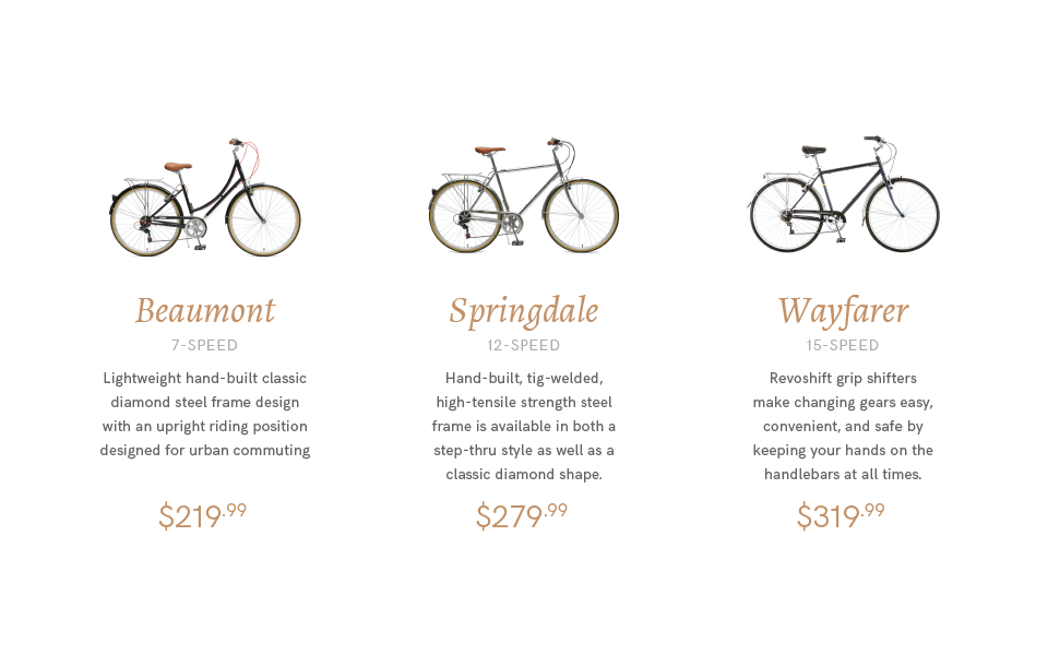 Before
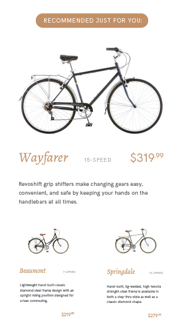 After (mobile)
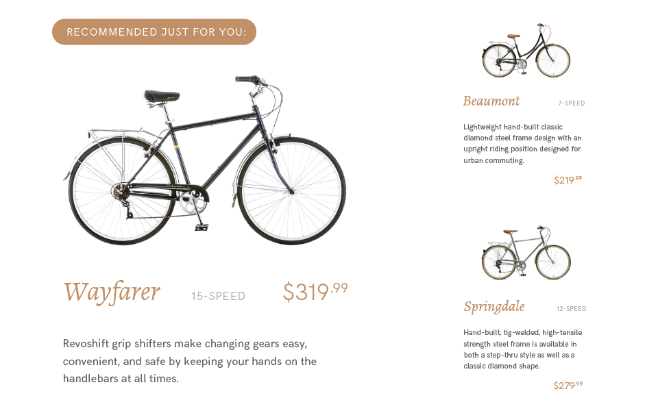 After (desktop)
# #14 Try exposing options instead of hiding them.
goodui.org/#14 (opens new window)
Create 3 options for a user to choose from (may be related to one of the above designs) and a sentence leading into the choice (a headline). Make it sound realistic: Don't say: "Do this, do that, Or something else". Realistic means it would say something like "Ready to start your day? Get coffee, get tea, get a smoothie."
# Before Design:
- 1024px × ~800px (it's okay to change the height)
- Typeset the lead sentence (headline)
- Design a dropdown below it. It should be an un-opened dropdown with something like "Choose an option"
- Create a design of the state of this dropdown. It has been clicked and is now displaying the 3 options.
- Remember, you don't need to completely fill the space with the dropdown menu. Small or medium-sized elements are fine, and so is negative space.
# After Design (Mobile):
- 375px × ~800px (it's okay to change the height)
Create the design again, but this time, pull the options out of the dropdown and expose them inside the design, similar to how they are exposed in the goodui.org example.
# After Design (Desktop):
- 1024px × ~800px (it's okay to change the height)
Adjust the After Design to be fluid. It should have the same content as the original design, but the position and size of your elements can change.
# Examplessh
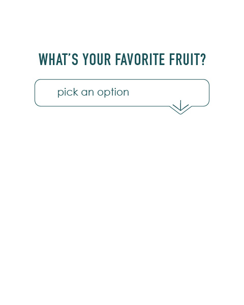 Before (closed)
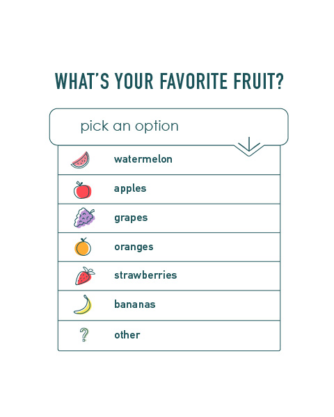 Before (opened)
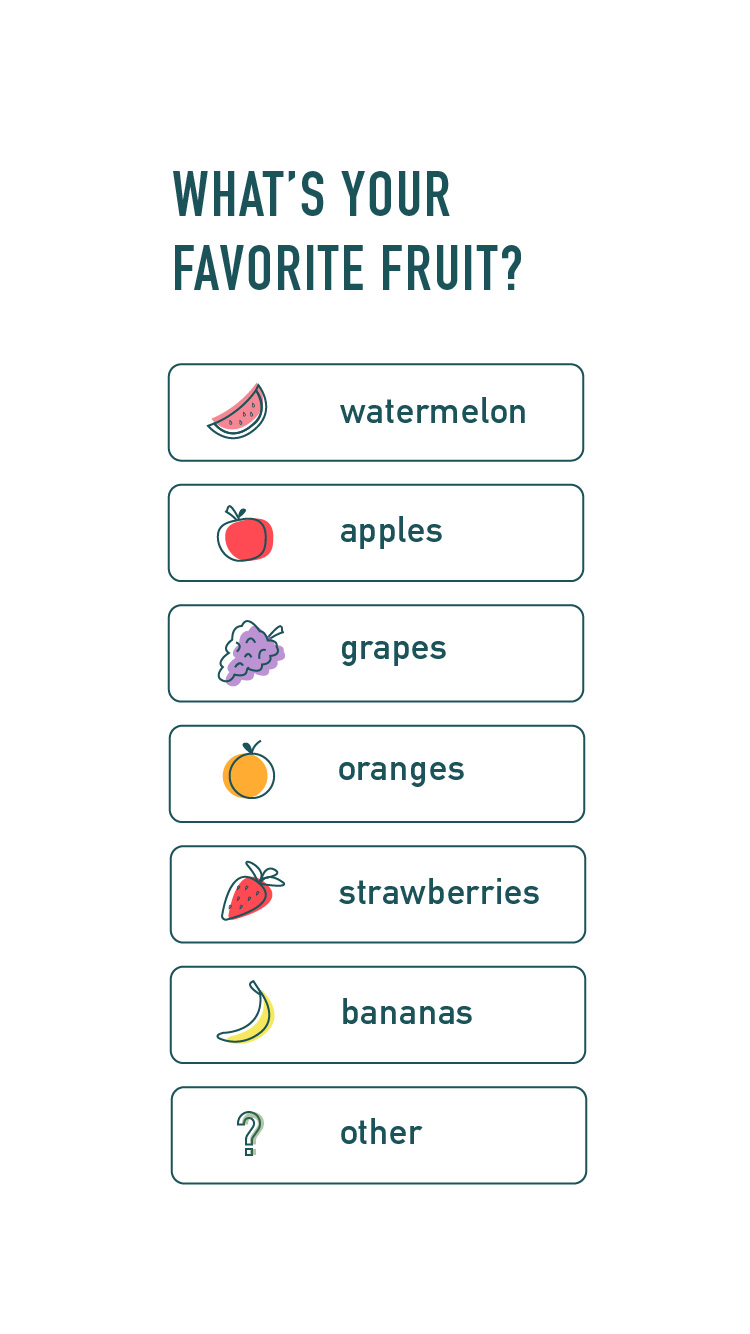 After (mobile)
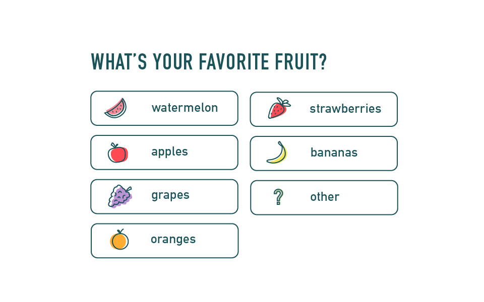 After (desktop)
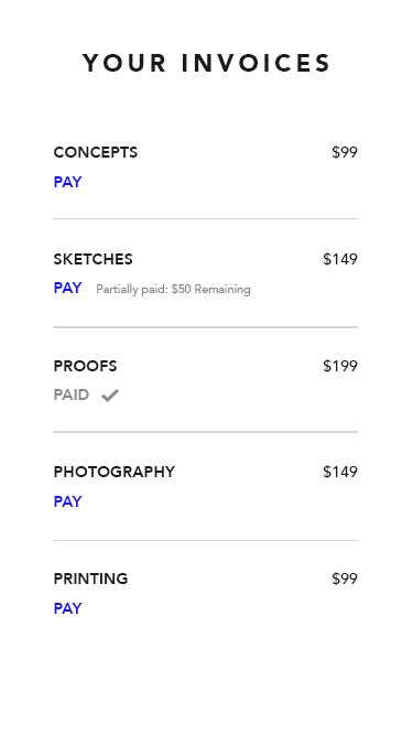
# #17 Try showing state instead of being state agnostic.
goodui.org/#17 (opens new window)
Create a tabular list of data like on goodui.org. You can use the same content that they have ("Your Invoices" followed by a list of invoices with a price by each). Where they have scribbles, you should have something that sounds real. Maybe related to one of the earlier designs).
# Before Design:
- 1024px × ~800px (it's okay to change the height)
- Create the table of data with a headline ("Your Invoices") followed by the list of items (the invoices) and their price.
- Remember, you don't need to completely fill the space with the table. Small or medium-sized elements are fine, and so is negative space.
# After Design (Mobile):
- 375px × ~800px (it's okay to change the height)
Create the design again, but this time, give users the option to pay directly inside the table. Show one of the items (invoices) as having been paid. Show one of them as having been partially paid.
# After Design (Desktop):
- 1024px × ~800px (it's okay to change the height)
Adjust the After Design to be fluid. It should have the same content as the original design, but the position and size of your elements can change.
# Examples
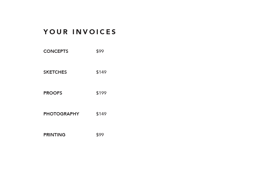 Before
 After (mobile)
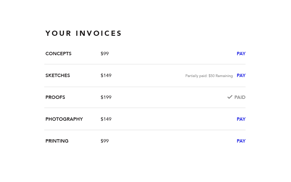 After (desktop)
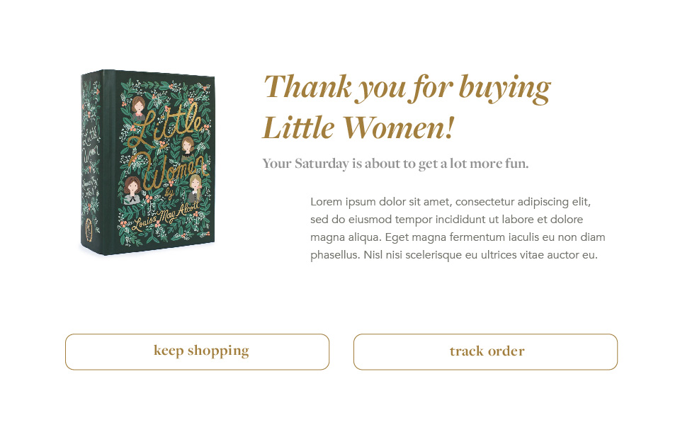
# #52 Try thanking instead of simply confirming completion.
goodui.org/#52 (opens new window)
The user has just completed one of the actions that you wanted them to complete in the designs above (e.g. they purchased the recommended product in #7 ). They are directed to a new screen where you acknowledge they did what you wanted them to do.
# Before Design:
- 1024px × ~800px (it's okay to change the height)
- Have an acknowledgment statement saying something general like "We got your order!" or "Your free month is on the way!" as your headline.
- Follow it with 3 sentences of lorem ipsum.
- Remember, you don't need to completely fill the space with the design. Small or medium-sized elements are fine, and so is negative space.
# After Design (Mobile):
- 375px × ~800px (it's okay to change the height)
- Create the design again, but this time, thank the user, followed by a "You" statement. Example:
Thank you statement: "Thank you for buying [PRODUCT NAME]. - You Statement: "Your to-do lists are about to get a lot more fun."
- Then 3 sentences of lorem ipsum
- Then 2 calls to action (the blue text in goodui.org). Write them to sound realistic.
# After Design (Desktop):
- 1024px × ~800px (it's okay to change the height)
Adjust the After Design to be fluid. It should have the same content as the original design, but the position and size of your elements can change.
# Examples
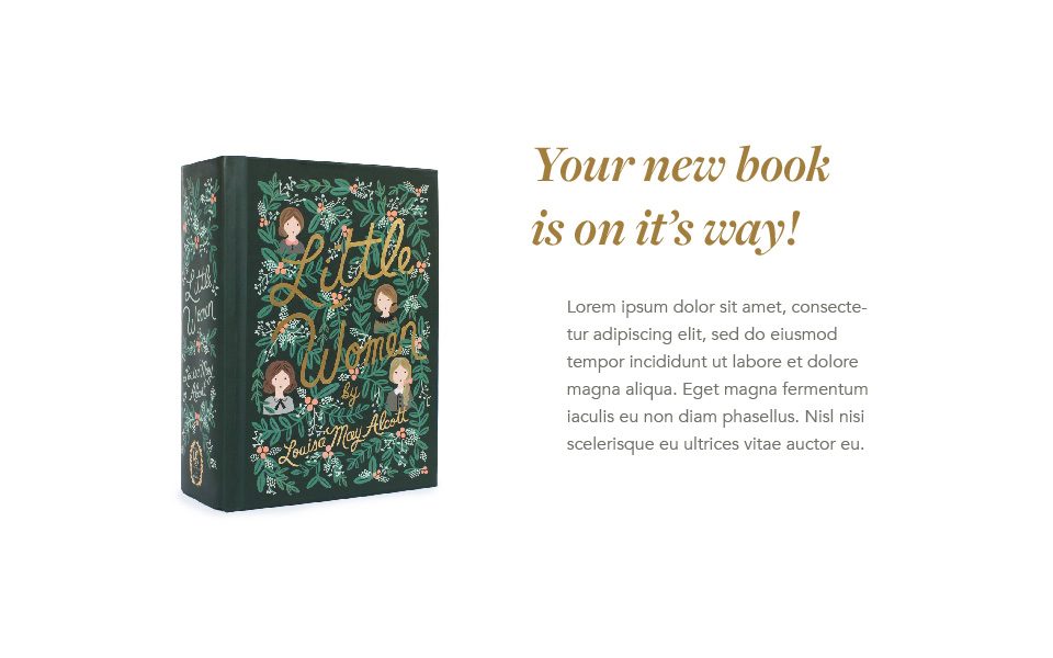 Before
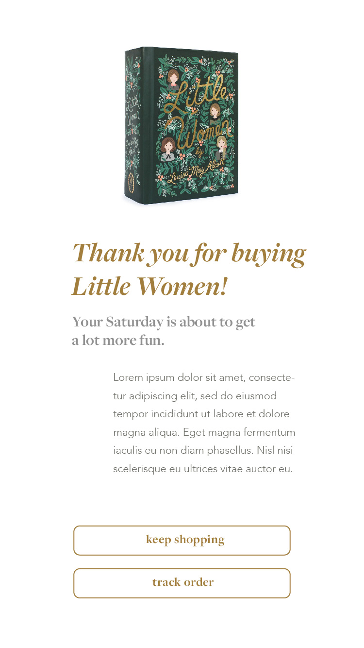 After (mobile)
 After (desktop)
# Fonts
Continue sticking to fonts available from Google's Font Library (opens new window), Adobe Fonts (opens new window) if you have an Adobe CC Subscription, or Font Squirrel (opens new window).
# Summary and Research
Write a short summary (75–200 words) on your findings from this assignment, with emphasis on the before and after designs and any principles you learned from goodui.org. You should also mention any thoughts you have on the process of re-designing for desktop/mobile.
You should also save a few items of research and sketches to share during critique (saved to your InVision board).
# Presentation
Add your research, sketches, and summary to your InVision board.
- Make a section on your InVision board called Project 3, Summary.
- Arrange your summary in an InVision text note.
- Make a section on your InVision board called Project 3, Research and Sketches.
- Arrange 3–7 items of research.
- Arrange a few relevant sketches.
Add your final graphics to your InVision board.
- Make a section on your InVision board called Project 3, #7.
- Arrange the before, after and mobile designs neatly in the section.
- Do this for each design.
- These designs should be above your sketches, summary, and research.
Also: Send me your Sketch file via Slack. I actually want to see how you build this thing.