# Project 4: Navigation Re-Design
# Virtual wayfinding
Points: 75
Site navigation is an extremely important aspect of web design that we haven't gotten to touch on much. Arguably, without it, you don't have a "site" at all, just a collection of loose documents. Navigation provides the user, not only a way to get around, but also a way of informing them of where they are, where they might want to go, and just how big the site is. It's wayfinding for virtual space.
# Objective
Your task is to re-design the navigation of a large website.
- Further practice designing user-interfaces in Photoshop/Illustrator/XD/Sketch
- Practice designing stateful user-interface designs
# Subject
Conduct some research and find a site where you find significant problems with its navigation. Since we're looking for inferior design and a large site, avoid "best of" galleries. Dig through your bag or the drawers in your desk and visit the brand name's websites of the objects you find there. Look for e-commerce sites where you could buy that item again (large companies and e-commerce sites are likely subjects for this assignment).
All non-navigation items can simply be grayed out so feel free to adjust colors, typefaces, etc. We don't care about sticking to any kind of branding or anything here, we just want a large set of organized pages to work with.
# Statefulness
Your navigation designs need to show state, that is, things that open, close or otherwise change on hover or click/touch need to be shown as separate designs.
You don't need to be too redundant though if multiple sub-menus are treated the same, you don't necessarily have to show both.
# Responsive
The complexity of a large navigation system often means very different strategies for mobile and desktop. Often, what works for desktop simply doesn't translate to smaller screens. Whatever your approach, you will need to show both mobile and desktop, and they might use different design strategies.
# Examples
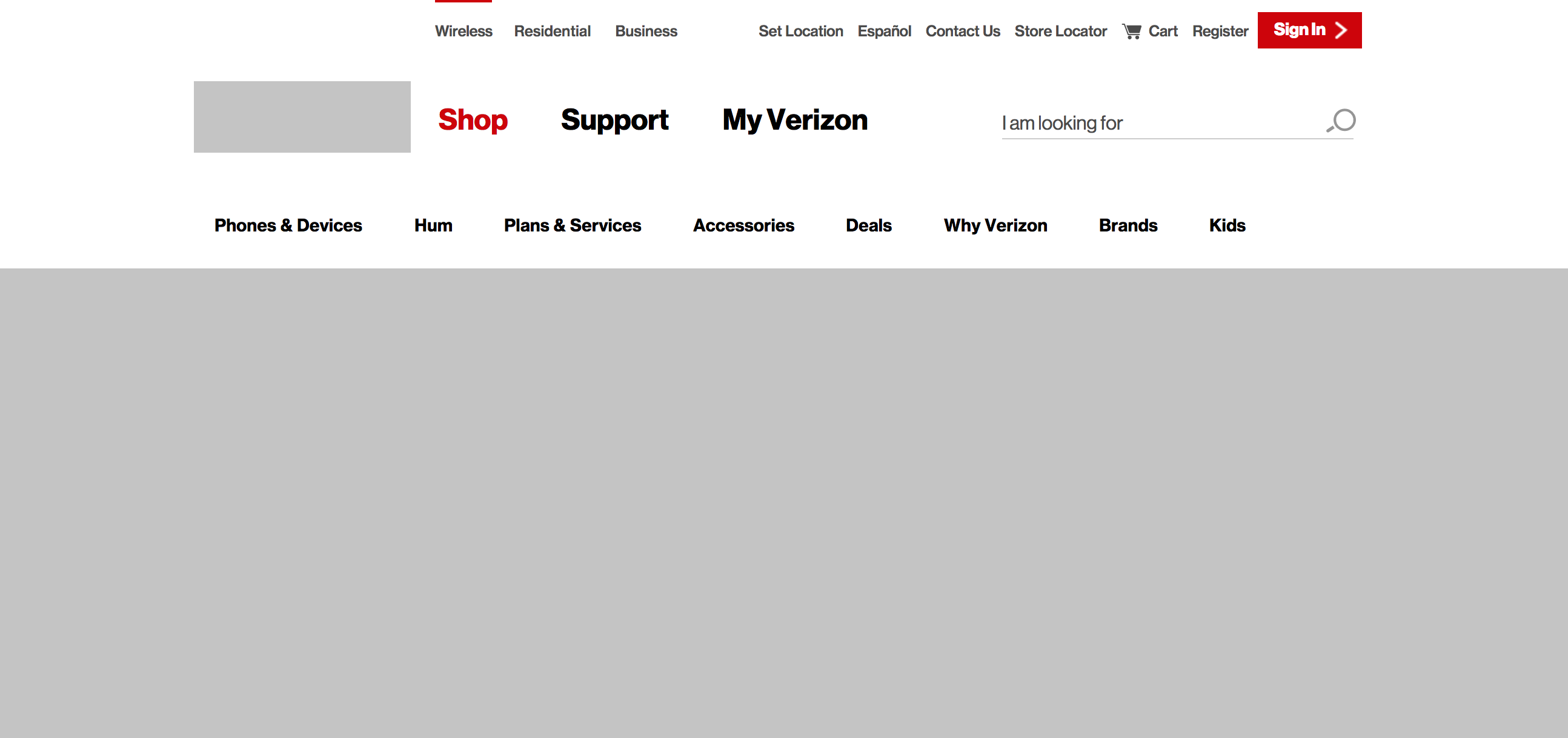
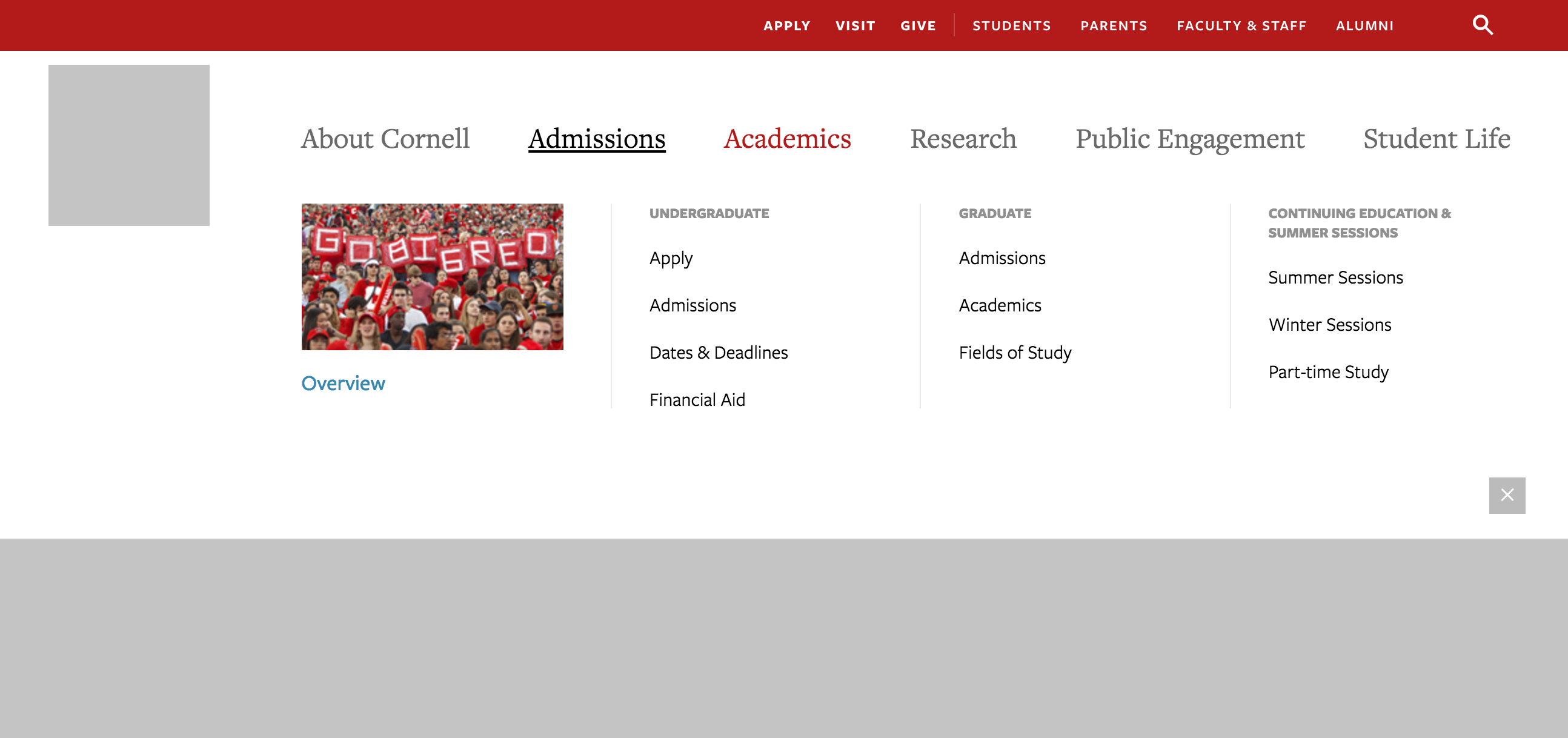
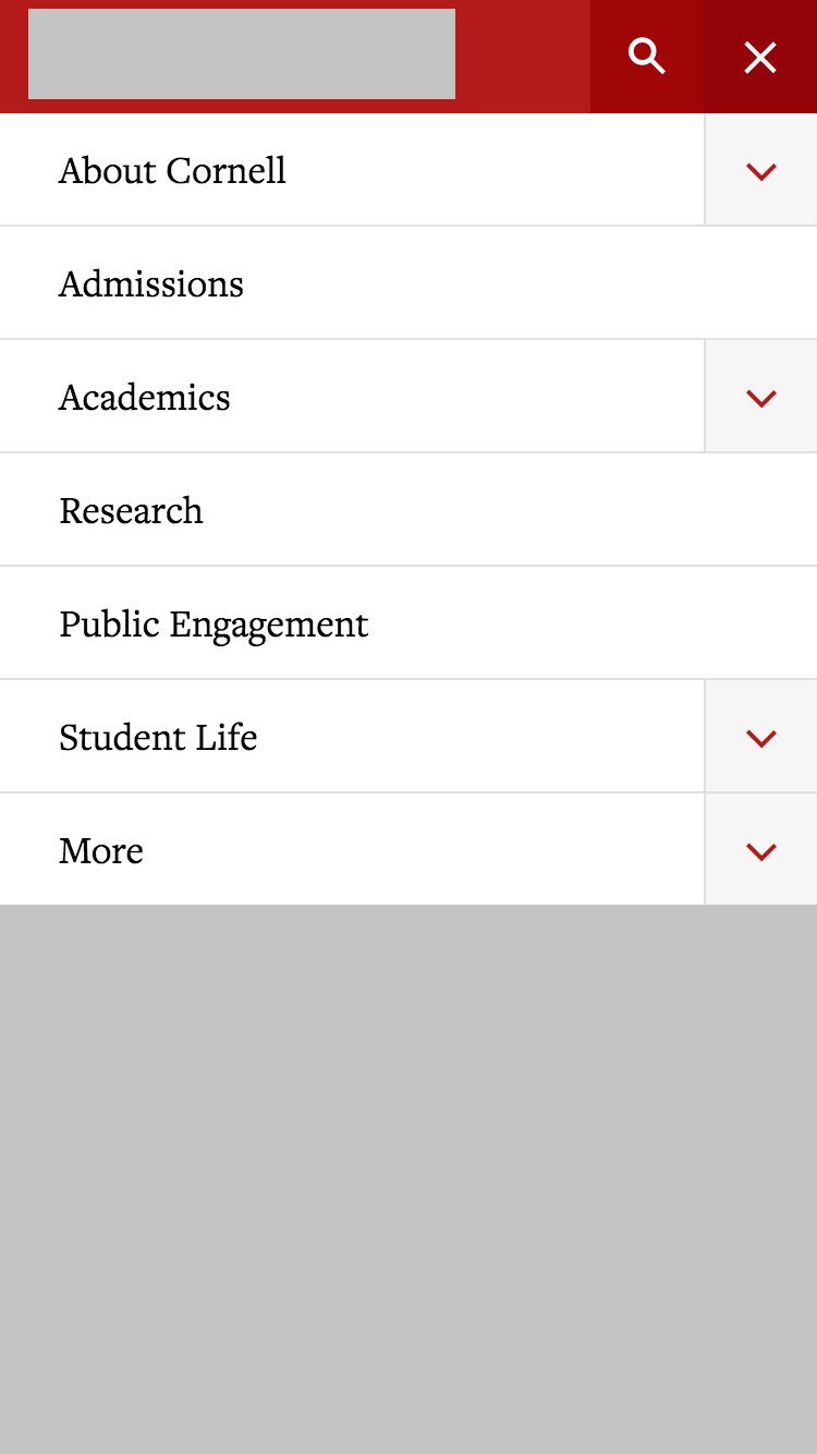
Here are some examples taken from a few websites, showing how you might design navigation while graying out the rest of the site.
I choose this one somewhat randomly, and because it was a large data set.
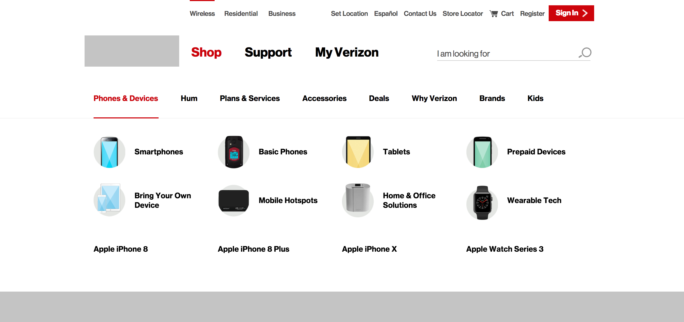
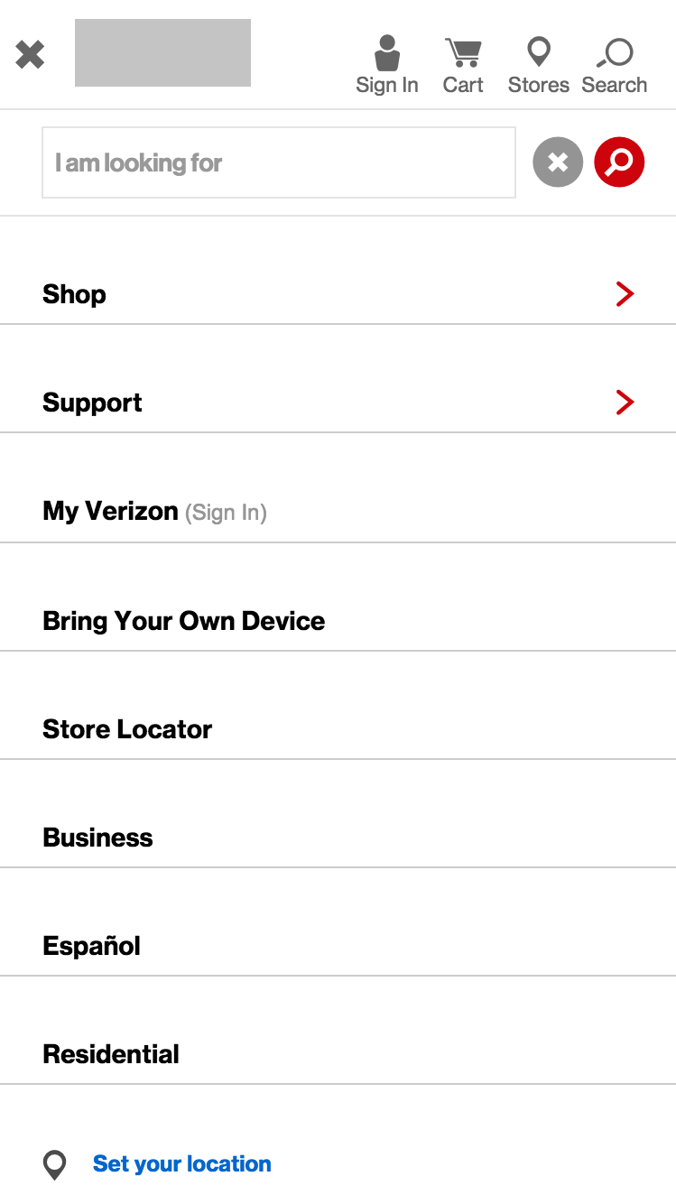
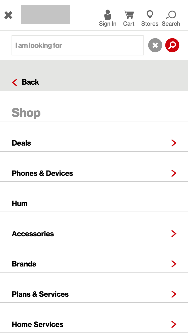
Lately, I've often referred to this site when working on navigation. I feel it's pretty successful at wayfinding and giving the user a great starting point. Labels are clear and it gives the user a ton of information, while also staying out of their way. The mobile design is a traditional accordion style.


# Research
Familiarize yourself with basic web navigation patterns (opens new window). You've likely already seen all of these in action. When it comes to user interface elements (and generally in design), it's important to understand the basics of what has been proven to work before attempting innovations.
# Information Architecture
Once you find a site with navigation you think is unsuccessful, it's time to analyze why. If your conclusion is that all of its problems have to do with visuals and experience, then you can move towards design. However, if it's because labels don't make sense, sections are in the wrong order, or some pages are in the wrong section, then you may need to re-organize. Typically, we'd just write an outline to make our improvements, but an informal sitemap might also help in deciding how best to organize the navigation (even if it's just on paper). Remember, navigation isn't just for getting around, but should, ideally, give the user a sense of the site as a whole.
# Sketch, Wireframe, Sketch
With complex UI like this, do not assume your first idea is the best. I need you to convince me that your final idea strategy is the best one, and there's no better way to do that than show me the strategies you've rejected. So please produce detailed sketches showing other possible strategies than your final. It doesn't matter if it's on paper or a computer wireframe, but they need to have enough detail that the pros and cons of each strategy are apparent. If you stick to paper, scan them so they are decent quality for presentation.
# Design
I'm going to encourage you to stick with Adobe XD or Sketch for this assignment However, I know the learning curves for new software can be tough, so using Illustrator or Photoshop will be fine as well.
# Prototyping
I want you to try at least some prototyping. How you do this relate to which program you choose to produce your work in.
Minimally, I would like to see one prototype of some state change in your designs, this change would be caused by a user click. This means along with producing both designs (open/closed, for example) you will add clickable spots that will change one design to another, mimicking real-world use.
Sketch and XD both have prototyping built-in...
Sketch Prototyping (opens new window)
XD Prototyping (opens new window)
You will then upload them to Sketch Cloud, or for XD, you can "Share for Review" (opens new window)
With Illustrator or Photoshop, you will need to export your artboards to PNGs, like you normally would, then you can upload them to InVision to make your prototype, then share a link.
InVision Prototyping (opens new window)
Follow the appropriate instructions above to create a simple prototype we can view during the critique.
# Requirements
Please pick a site with at least two tiers of navigation, at least 6 items on its main tier, and some form of utility navigation. The larger the amount of navigation, the harder it might be to design but remember, in this class, you're practicing for real-world problems you might encounter as a professional. Successful information architecture might reduce the complexity of navigation, but ultimately, a large site is a large site.
About half of users are what Jacob Nielsen calls "Search Dominant". Search is a must-have feature on any large website. Include a search box as part of your design.
# Presentation
Add your research and sketches to your InVision board.
- Make a section on your InVision board called Project 4, Research and Sketches.
- Arrange 3–7 items of research.
- Arrange a few relevant sketches.
Add your final graphics to your InVision board.
- Make a section on your InVision board called Project 4, Mobile Designs.
- Arrange all of your stateful mobile designs neatly in the section.
- Make a section on your InVision board called Project 4, Desktop Designs.
- Arrange all of your stateful desktop designs neatly in the section.
Add your prototype link to your InVision board.
- Make a section on your InVision board called Project 4, Prototype.
- Add a link to your prototype.
Due Dates
I want to give a little extra time to put some polish on this project. Please make sure you meet all minimum requirements for critique (mobile and desktop designs, plus an attempt at a prototype) Then, we will have and extra class period before I consider the project due.
April 1st: Critique
April 3rd: Final Due
# Wise Words from Steve Krug
# The unbearable lightness of browsing
Looking for things on a Web site and looking for them in the “real” world have a lot of similarities. When we’re exploring the Web, in some ways it even feels like we’re moving around in a physical space. Think of the words we use to describe the experience—like “cruising,” “browsing,” and “surfing.” And clicking a link doesn’t “load” or “display” another page—it “takes you to” a page.
But the Web experience is missing many of the cues we’ve relied on all our lives to negotiate spaces. Consider these oddities of Web space:
No sense of scale. Even after we’ve used a Web site extensively unless it’s a very small site we tend to have very little sense of how big it is (50 pages? 1,000? 17,000?). For all we know, there could be huge corners we’ve never explored. Compare this to a magazine, a museum, or a department store, where you always have at least a rough sense of the seen/unseen ratio.
The practical result is that it’s very hard to know whether you’ve seen everything of interest to you in a site, which means it’s hard to know when to stop looking.
No sense of direction. In a Web site, there’s no left and right, no up and down. We may talk about moving up and down, but we mean up and down in the hierarchy—to a more general or more specific level.
No sense of location. In physical spaces, as we move around we accumulate knowledge about the space. We develop a sense of where things are and can take shortcuts to get to them.
We may get to the chainsaws the first time by following the signs, but the next time we’re just as likely to think, “Chainsaws? Oh, yeah, I remember where they were: right rear corner, near the refrigerators.” And then head straight to them.
But on the Web, your feet never touch the ground; instead, you make your way around by clicking on links. Click on “Power Tools” and you’re suddenly teleported to the Power Tools aisle with no traversal of space, no glancing at things along the way.
When we want to return to something on a Web site, instead of relying on a physical sense of where it is we have to remember where it is in the conceptual hierarchy and retrace our steps.
This is one reason why bookmarks—stored personal shortcuts—are so important, and why the Back button is the most used button in Web browsers.
It also explains why the concept of Home pages is so important. Home pages are—comparatively—fixed places. When you’re in a site, the Home page is like the North Star. Being able to click Home gives you a fresh start.
This lack of physicality is both good and bad. On the plus side, the sense of weightlessness can be exhilarating and partly explains why it’s so easy to lose track of time on the Web—the same as when we’re “lost” in a good book.
On the negative side, I think it explains why we use the term “Web navigation” even though we never talk about “department store navigation” or “library navigation.” If you look up navigation in a dictionary, it’s about doing two things: getting from one place to another, and figuring out where you are.
I think we talk about Web navigation because “figuring out where you are” is a much more pervasive problem on the Web than in physical spaces. We’re inherently lost when we’re on the Web, and we can’t peek over the aisles to see where we are. Web navigation compensates for this missing sense of place by embodying the site’s hierarchy, creating a sense of “there.”
Navigation isn’t just a feature of a Web site; it is the Web site, in the same way, that the building, the shelves, and the cash registers are Sears. Without it, there’s no there-there.
The moral? Web navigation had better be good.
# The overlooked purposes of navigation
Two of the purposes of navigation are fairly obvious: to help us find whatever it is we’re looking for and to tell us where we are.
But navigation has some other equally important—and easily overlooked—functions:
It tells us what’s here. By making the hierarchy visible, navigation tells us what the site contains. Navigation reveals content! And revealing the site may be even more important than guiding or situating us.
It tells us how to use the site. If the navigation is doing its job, it tells you implicitly where to begin and what your options are. Done correctly, it should be all the instructions you need. (Which is good, since most users will ignore any other instructions anyway.)
It gives us confidence in the people who built it. Every moment we’re in a Web site, we’re keeping a mental running tally: “Do these guys know what they’re doing?” It’s one of the main factors we use in deciding whether to bail out and deciding whether to ever come back. Clear, well-thought-out navigation is one of the best opportunities a site has to create a good impression.
# The Sections
The Sections—sometimes called the primary navigation—are the links to the main sections of the site: the top level of the site’s hierarchy.
In some designs, the persistent navigation will also include space to display the secondary navigation: the list of subsections in the current section.
In others, pointing at a section name or clicking on it reveals a dropdown menu. And in others, clicking takes you to the front page of the section, where you’ll find the secondary navigation.
# The Utilities
Utilities are the links to important elements of the site that aren’t really part of the content hierarchy.
These are things that either can help me use the site (like Sign in/Register, Help, a Site Map, or a Shopping Cart) or provide information about its publisher (like About Us and Contact Us).
Like the signs for the facilities in a store, the Utilities list should be slightly less prominent than the Sections.
— Steve Krug, Don't Make Me Think (2nd Edition)