# The CSS Box Model
Lecture CodePen (opens new window)
CSS Basic Box Model is a module of CSS that defines the rectangular boxes—including their padding and margin—that are generated for elements and laid out according to the visual formatting model.
...every element in web design is a rectangular box. This was my ah-ha moment that helped me really start to understand CSS-based web design and accomplish the layouts I wanted to accomplish.
— Chris Coyier (CSS-Tricks)
# The Box
So far, we've just talked about colors, typography, etc.—styling our content. But now we need to get into the actual layout, and things are going to get a bit more complicated.
All block-level elements on your page can be thought of as boxes (we're excluding inline elements like <span>, <a>, <em>, etc.)
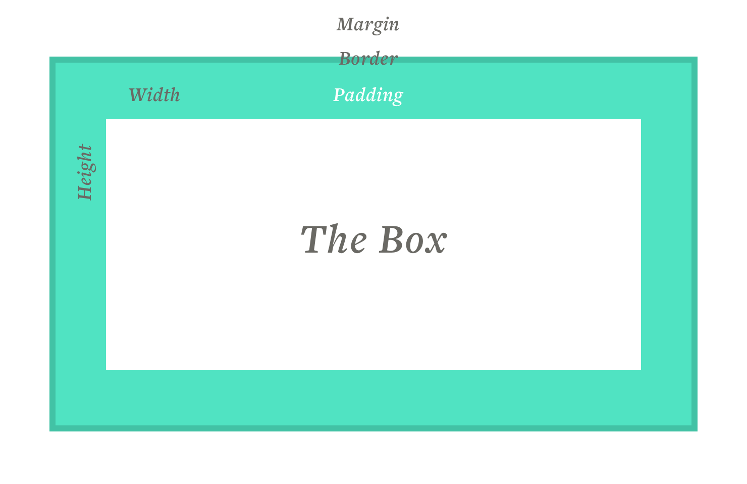
The "box-model" describes these boxes. Here's what you get with a box in CSS...
- width
- height
- padding (whitespace inside the box)
- border
- margin (whitespace outside of the box)
You can describe these with the following CSS properties:
div {
    width: 500px;
    height: 200px;
    padding: 1em;
    border-width: 2px;
    border-color: gray;
    border-style: solid;
    margin: 1em;
}
2
3
4
5
6
7
8
9
# Width and height
For responsive design, there are also min and max widths and heights:
div {
    min-width: 200px; /* there's also min-height */
    max-width: 600px; /* there's also max-height */
    width: 100%; /* You can use percentages, but their best for widths, probably avoid them for heights */
}
2
3
4
5
That box would try to be as wide as possible, but with constraints on how small and how large it can grow and shrink.
# Height issues
Try to avoid setting a height on items with text inside. If the item is responsive, the text will reflow, possibly spilling out of your item. Let your content automatically set the height.
# Margin and padding
Margins and padding are the key way we create space in our designs. Padding creates whitespace within our element, separating the content from its borders, Margin creates whitespace around the element.
# Margin
If we have a <p> tag, we can use a few different properties to add margin. We'll need to choose wisely, to make sure specificity works like we'd want it to.
p {
    margin: 1em; /* one value means all sides will have the same margin */
}
2
3
If our font-size was 16px, then 16px = 1em, so we'd get 16px of white space on all sides of our element. If we want to have different margins on different sizes of our element, we can separate them in two ways...
p {
    margin-top: 1em;
    margin-right: 10px;
    margin-bottom: 1.2em;
    margin-left: 0;
    /* or we can use the shorthand property */
    margin: 1em 10px 1.2em 0;
}
2
3
4
5
6
7
8
Both margin and padding's shorthand properties follow the pattern top, right, bottom, left (clockwise). Some people remember this as “TRouBLe” (TRBL).
Whenever you use a shorthand property, you will be setting all of the side's margin size, if you use a specific margin property, you're only setting one side, leaving the rest to be either default or inherit those settings.
We can also set top/bottom and left/right like...
p {
    margin: 1em 0;
}
2
3
# Margin collapse
One not-so-obvious thing to know about margins is the concept of "margin collapse". If we have two elements on top of each other, with the top element having a bottom margin of 20px and the bottom element having a top margin of 20px, the space between them will be 20px. Margins will basically overlap when stacked.
If we had an element with 30px at the bottom, and one with 20px at the top, the larger one will win, making the gap 30px total.
Mastering Margin Collapse (opens new window)
If you think about it, this is actually useful, especially for text blocks and paragraphs. If we want our text elements, like headings and paragraphs, to be interchangeable and mixable, it would be useful if we could style the vertical space between them to adjust to whatever order items happen to flow in. If you want 20px of space on the top and bottom of your paragraphs, that probably doesn't mean you want 40px when you put two paragraphs together. But the first and last paragraphs in a block will still get the 20px on either side.
# Auto margins
Margins have a super-power that aids us in centering content. They can be set to "auto". An easy way to center something is to use the following CSS...
.my-element {
    margin: 0 auto;
    width: 400px;
}
2
3
4
This sets the top and bottom margin to 0, and the left and right to auto. The trick is, this only works on the left and the right, and you must have some kind of set width.
We'll need Flexbox to help us center vertically, which we'll talk about later.
# Padding
Padding properties work similarly to margin properties and still follow the clockwise style of using the shorthand property.
div {
    padding-top: 1em;
    padding-right: 10px;
    padding-bottom: 1.2em;
    padding-left: 0;
    /* or we can use the shorthand property */
    padding: 1em 10px 1.2em 0; /*
}
2
3
4
5
6
7
8
One of the key differences between margin and headings is how borders and backgrounds relate. Padding puts space between the border and the content, creating "white" space that will be filled with the background color, while the margin adds space outside of the borders and backgrounds.
Given the following HTML and CSS...
<div class="wrapper">
    <div>Lorem ipsum dolor sit amet...</div>
</div>
2
3
.wrapper {
  background-color: #ccc;
}
.wrapper > div {
  background-color: #333;
  color: white;
  padding: 1em;
  border: 2px solid red;
  margin: 1em;
}
2
3
4
5
6
7
8
9
10
We get the following result.
As you can see, the dark gray box we set the margin and padding on, shows its background for 1em around the content, where it then has a border, and outside of that, a margin where you see the containing div's lighter background color.
Notice you don't see the light gray above or below, that's the margin collapse working... the paragraph above is pushing down as well. We'd have to add padding to the outside box instead if that's what we wanted.
# Borders
Borders in CSS can be applied to any block element, just like padding and margin. They need three values: width, style, and color.
Width can be any value, but you'll usually use pixels. To add a thin gray border, you would use the CSS:
div {
    border-width: 1px;
    border-style: solid;
    border-color: gray; /* You could use an rgba color here for transparency */
    /* or use the shorthand */
    border: 1px solid gray;
}
2
3
4
5
6
7
You can also specify borders on just some sides (top, right, bottom and left), or change the properties for certain sides of the box...
div {
    border-left-width: 1px;
    border-left-style: solid;
    border-left-color: gray;
    /* or the shorthand */
    border-left: 1px solid gray;
}
2
3
4
5
6
7
If you wanted a border on all sides except one, it would be easier to first apply them to all sides, then use the keyword none to turn off one side...
div {
    border: 1px solid gray;
    border-bottom: none;
}
2
3
4
Border styles can be...
- dotted
- dashed
- solid
Most of the time, you'll just want to use solid. You won't have the kind of control over dots and dashes as you would in Adobe Illustrator.
Technically, you can also apply borders to inline elements as well. You could use a bottom-border instead of an underline, allowing you to use a different color or make a thicker underline, by using the CSS...
a {
    text-decoration: none; /* turns off the default underline style on links */
    border-bottom: 1px solid blue;
}
2
3
4
# Border radius
We can round the corners of our boxes with the border-radius property. You don't actually have to have a border width or style to use this, every box has a border (even if it's 0 width), and its corners can be rounded.
div {
    border-radius: 4px; /* applies to all corners */
    border-radius: 4px 5px 6px 7px; /* Top-Left, TR, BR, BL */
}
2
3
4
The shorthand property goes clockwise starting at the top left corner.
You can use this to make circles out of your boxes.
div {
    width: 100px;
    height: 100px;
    border-radius: 50px;
    background-color: rgb(56, 196, 165);
}
2
3
4
5
6
creates...
You can also try...
div {
    border-radius: 50%;
}
2
3
But either way, the item would need to be a square to create a perfect circle.
# Box-sizing
Now we've got to get into something a little convoluted, so we'll step through this carefully.
The original CSS specifications worked like this... I set my box to 400px wide and 400px high. I add 10px padding, 1px border and 20px of margin. How big does my box appear on the page? 400px + 20px + 2px = 462px. This is a bit counter intuitive, but padding and border were added to the dimensions we set, and that's the way it was designed to work.
Most people prefer to set their box sizes having padding and border be subtracted from them instead, and this is possible, with a property called box-sizing. When we get into responsive coding, you'll see why.
Imagine placing two boxes next to each other and setting one for 50% and the other for 50%. They should add up to 100%. But with the default box-sizing model, any padding would break our layout.
This CSS-Tricks article explains it well. (opens new window)
We can fix this by setting...
div {
    box-sizing: border-box; /* content-box is the icky default. */
}
2
3
border-box gives us the easier model we need. However, it'd be a pain to set this on every element, so there's a global code snippet we can use instead.
html {
  box-sizing: border-box;
}
*, *:before, *:after {
  box-sizing: inherit;
}
2
3
4
5
6
Place this CSS near the beginning of your stylesheet on every project and it will set box-sizing to border-box on all of your elements. However, if for some reason you want to use content-box (or maybe you have a third party plugin that uses it), you can set it on an element and it will still work.
The above code sets the box-sizing property on the root html element, and then the asterisks tell every other element to inherit that value.
Oh yeah, there's a selector * that selects every element. I don't suggest using it for anything else.
# Overflow
Now it's time to talk about overflow. This property tells a box what to do if there's more content than can fit.
Typically if you only set the width of a box, it's height will auto-adjust to fill all of the content. This is great, and exactly what we want for responsive design. Sometimes though, we need to set a height, and we could end up with bugs where our content overflows.
So let's look at our options for this property.
div {
    overflow: visible; /* default, content spills out */
    overflow: hidden; /* content is clipped */
    overflow: scroll; /* content is scrollable */
    overflow: auto; /* kinda the same as scroll, but in this case, only if needed */
}
2
3
4
5
6
There are also the overflow-x and overflow-y properties. They allow you to set these same controls, but only in one direction. If you want to allow scrolling, but only vertically, you might set overflow-y: scroll; overflow-x: hidden; (x is the horizontal axis, y is vertical).
You should be careful with scrolling though, it may not always be intuitive that an area is scrollable. In the past, browsers had visible scrollbars that took up space. Setting overflow: scroll; on an element made a scrollbar appear there. A design problem, since they were often ugly, but, now, the scrollbar is usually invisible, so it's not easy to know something can be scrolled unless there are other visual clues (some indication of continuing content).
hidden is commononly used to fix weird bugs or to hide animations.
# Resources
The CSS Box Model: CSS-Tricks (opens new window)